Pentagram has designed a new brand identity for the global paper company Fedrigoni. Established in Italy in 1888, Fedrigoni has a long tradition and relationship with creativity and design at the highest level. Best known for its fine paper, its products are loved by the design industry and used widely for everything from printing, editing, labels, bookbinding and packaging.
The first title
The design team was asked to create a global identity for Fedrigoni, rationalising its current sub-brands (including recently acquired brands such as Ritrama) and creating a new identity for the Pressure Sensitive Labels (PSL) division.

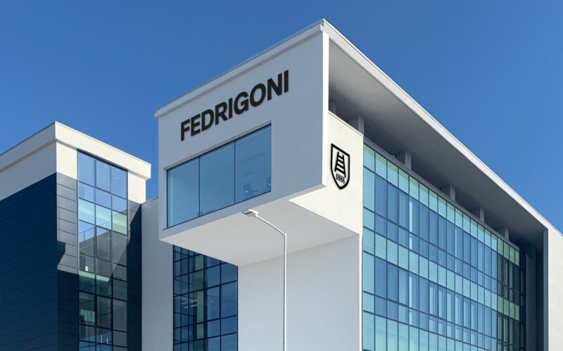
Fedrigoni recently released its Paper Box—a sculptural and highly collectable sample box designed by London studio Graphic Thought Facility (GTF). The minimal approach features the word ‘Fedrigoni’ in upper case, set in GTF’s carefully redrawn version of Italian designer Aldo Novarese’s 1968 font Forma.
Although it explored other approaches, the design team recognised the impact of GTF’s confident application of Fedrigoni’s wordmark in Forma and saw its potential to represent the Fedrigoni brand as a whole. As a result, the team decided to change the existing Fedrigoni logotype (set in the French typeface Peignot) to a redrawn version using Forma. This perfectly signifies Fedrigoni’s new global identity: strong, bold and confident and celebrating its strong Italian heritage.